- Install
- Basic operation
- Basics of programming for electronic work
- Basics of programming for Excel
- Machine learning with scikit-learn
- Visualizing data with matplotlib
- Basic
- Basic steps for displaying charts (video explanation)
- Create and show chart
- General chart
- Statistical chart
- Basic
- Web programming
- RPA programming
- Miscellaneous programming
- Reference
Create and show chart
Tsumicky version 0.0.4 and later can display charts using matplotlib, a Python data visualization library.
As of version 0.0.4, the following charts can be created.
| General charts |
|
|---|---|
| Statistical charts |
|
This page explains the common steps for creating the various charts listed above.
1. Prepare data
Enter the data to be used as the source of the graph into an Excel worksheet.
Enter the data in the same format as when creating a chart using Excel's own functions.
2. Connect to Excel server
The matplotlib integration function is part of the Excel server.
Therefore, first run the block in the "Excel" → "Basic" group that connects to the Excel server.

3. Initialize the graph
Initialize the chart by the "Initialize chart" block in the "matplotlib" → "Basic" group.

You can display multiple charts side by side, and specify the number of charts with the "rows" and "columns" parameters.
For example, to display two charts vertically and three charts horizontally, specify 2 for "rows" and 3 for "columns".
The "width" and "height" parameters specify the size of the window in which the charts will be displayed.
The size is measured in inches.
4. Creating a graph
After the chart initialization block, connect various blocks from groups such as "matplotlib" - "General chart" to determine the content to be displayed on the chart.
5. Showing the chart
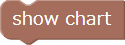
Once the chart content is complete, connect the "Show chart" block to display the chart window on the screen.