- Install
- Basic operation
- Basics of programming for electronic work
- Basics of programming for Excel
- Machine learning with scikit-learn
- Visualizing data with matplotlib
- Basic
- General chart
- Show a bar chart with only one series
- Show a bar chart with multiple series
- Draw a stacked bar chart
- Adding data labels to bar charts
- Show a line chart with only one series
- Show a line chart with multiple series
- Adding data labels to line charts
- Show a pie chart with only one series
- Show a pie chart with multiple series
- Statistical chart
- Web programming
- RPA programming
- Miscellaneous programming
- Reference
Show a bar chart with multiple series
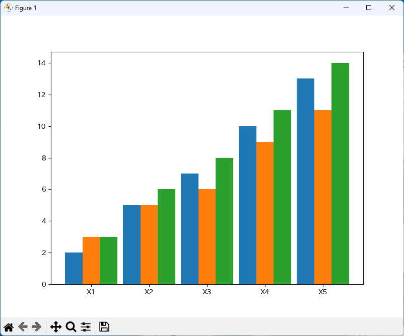
This page explains how to display a bar chart with multiple series.
1. Create the source data for the chart
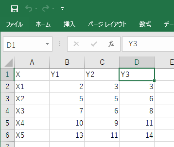
Enter the data that will be the source of the chart in an Excel sheet.
As shown in the image below, enter the values to be used as labels for the X-axis and the values you want to display as a bar chart.
Enter the values to be displayed in the adjacent range of cells.
2. Add blocks
Follow the steps on the "Creating and displaying charts" page to add the minimum required blocks.
3. Repeat according to the cell range of values
Use the "Repeat" group block to repeat by specifying a range and changing the variable value, and repeat according to the cell range of values.
In the case of the Excel sheet above, the values are in column B (2nd column) to column D (4th column), so use a repeat that changes the variable value from 2 to 4 by 1.
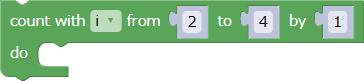
Put this block between the chart initialization and chart display blocks.
4. Repeat creating bar chart
Put a bar chart creation block inside the loop to create a bar chart for each series in turn.

This block is long horizontally, so it may be difficult to use if the width of the screen is narrow.
In that case, right-click the block and click "External Input" in the menu to change it to a vertical shape.
You can also right-click a vertical block and click "Inline Input" in the menu to change it to a horizontal shape.
4-1. Specifying bar width and bar position
When creating a bar chart with multiple series, use the "Bar width" and "Bar position" parameters to specify the width of the bars in the bar chart and the position where the bars are drawn.
The width of one tick corresponds to 100%.
The bar position is 0% when it is directly above the tick. Specifying a negative value will shift the bar to the left, and specifying a positive value will shift it to the right.
The bar is drawn so that its center is located at the specified position.
Basically, it is a good idea to set the following values for the "Bar width" and "Bar position" parameters.
This will line up the bars of each series tightly together, and there will be a gap of 10% of the width of one tick between adjacent ticks.
| Bar width | 90÷number of series |
|---|---|
| Bar position | (column number variable - (leftmost column number + rightmost column number)÷2)×bar width |
For example, as in the previous data example, suppose that data is entered in three columns from column B (2nd column) to column D (4th column) of an Excel sheet.
In this case, the values of the individual parameters in the above formula will be as follows.
| Number of series | 3 |
|---|---|
| Leftmost column number | 2 |
| Rightmost column number | 4 |
Therefore, specify 90÷3(number of series)=30 for the bar width.
In addition, (leftmost column number + rightmost column number)÷2 in the bar position formula becomes (4 + 2)÷2 = 3.
From here, for the bar position parameter, use a calculation block in the "Formula" group to specify the formula that represents (column number variable - 3) x 30.
4-2. Specifying colors
When plotting multiple series in a bar chart, you can distinguish between the series by giving each series a different color.
You can use matplotlib's default color combinations by specifying the "null" block in the "Logic" group for the "Line color" and "Interior color" parameters.

If you want to specify the colors yourself, create a list of the colors you want to use in the "Create list using" block in the "List" group before the loop.
Then, specify the colors selected from the list in order as the "Line color" and "Interior color" parameters of the "Create bar chart" block.
5. Examples
Here are two examples, one where colors are not specified and one where they are.
5-1. When colors are not specified (using matplotlib's default colors)
The following program is an example of how to display the chart at the top of this page.
A bar chart is displayed based on the Excel sheet shown in "2. Creating the source data for the chart".
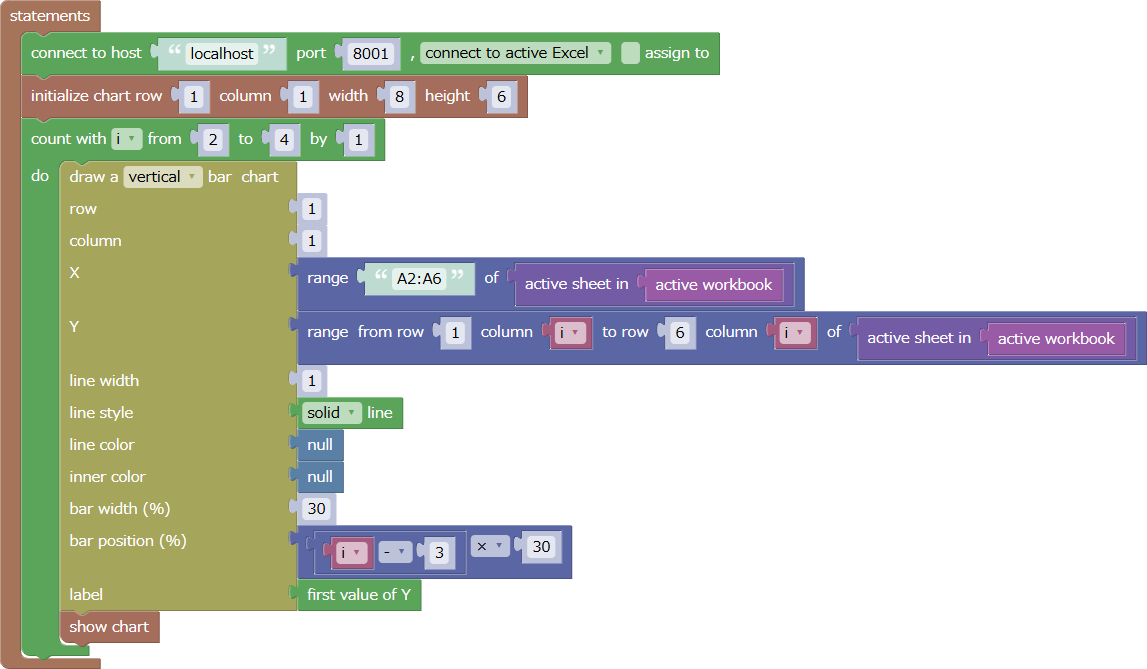
The file for this example can be downloaded from here.
The Excel data file used in this example can be downloaded from here.
When running this example, open the data file in Excel beforehand.
5-2. Specifying a color
The following program is an example where the previous program has been modified to specify a color.
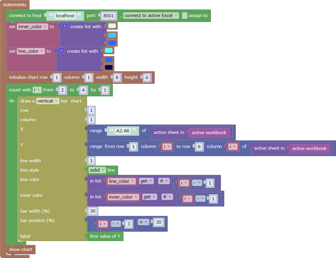
Before drawing the bar chart, a list containing three colors is assigned to the variables line_colors and inner_colors.
Then, when creating the bar chart, colors are taken from line_colors and inner_colors in order and specified as the line color/inner color parameters.
The variable i is changed from 2 to 4 in the repeat block, so i-1 changes from 1 to 3.
This value is used to extract the first, second, third, and so on, colors from the list.
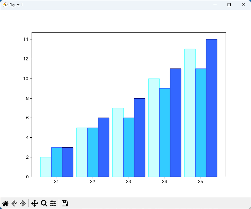
When you run this example, the following chart will be displayed.
The file for this example can be downloaded from here.
Also, the Excel data file used in this example can be downloaded from here.
When running this example, make sure you have the data file open in Excel beforehand.